Design System
Design System
Healthcare UX
Healthcare UX
SaaS Dashboard Design
SaaS Dashboard Design
B2B
B2B
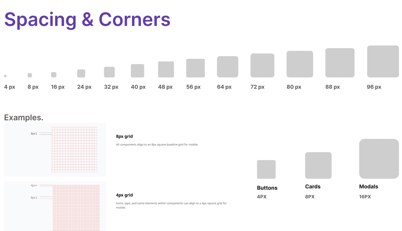
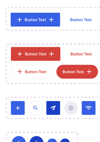
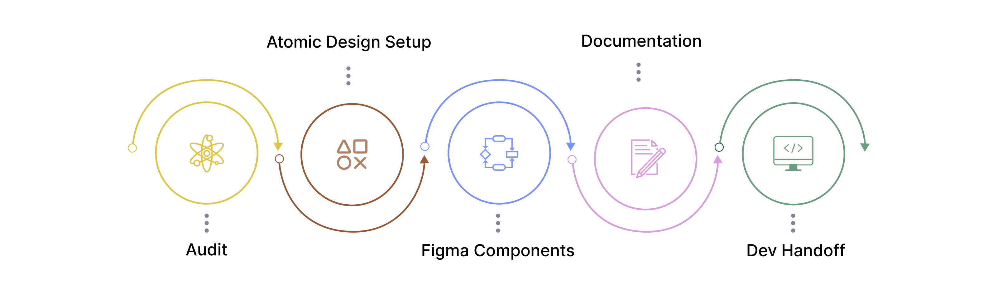
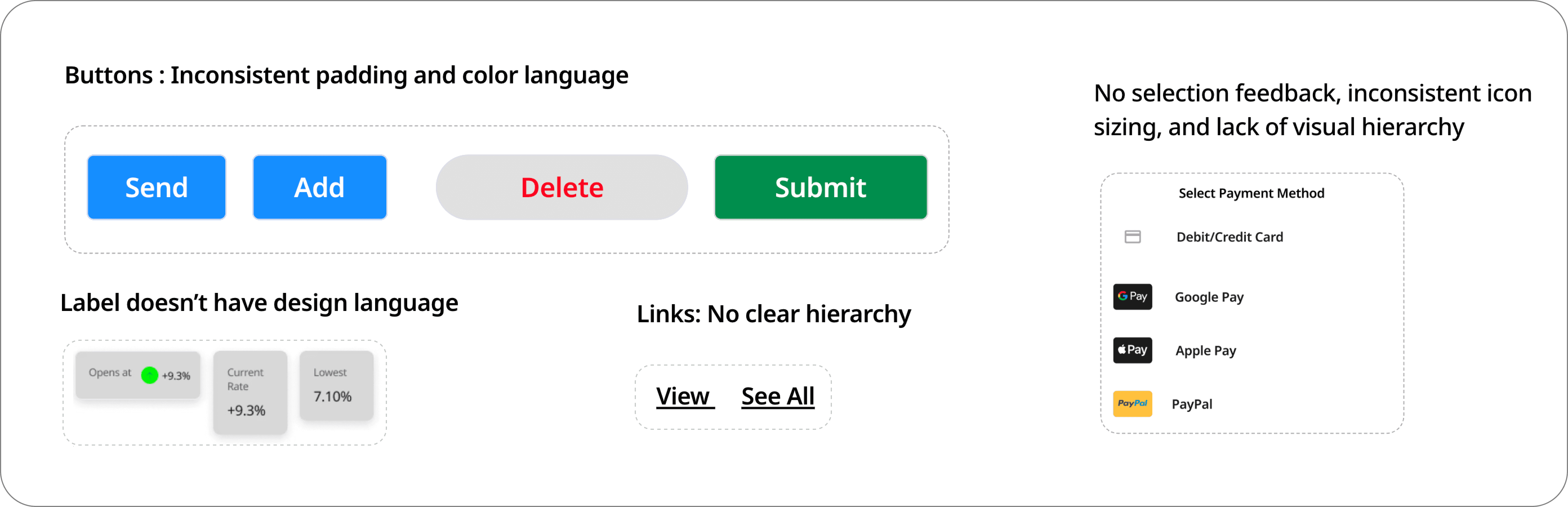
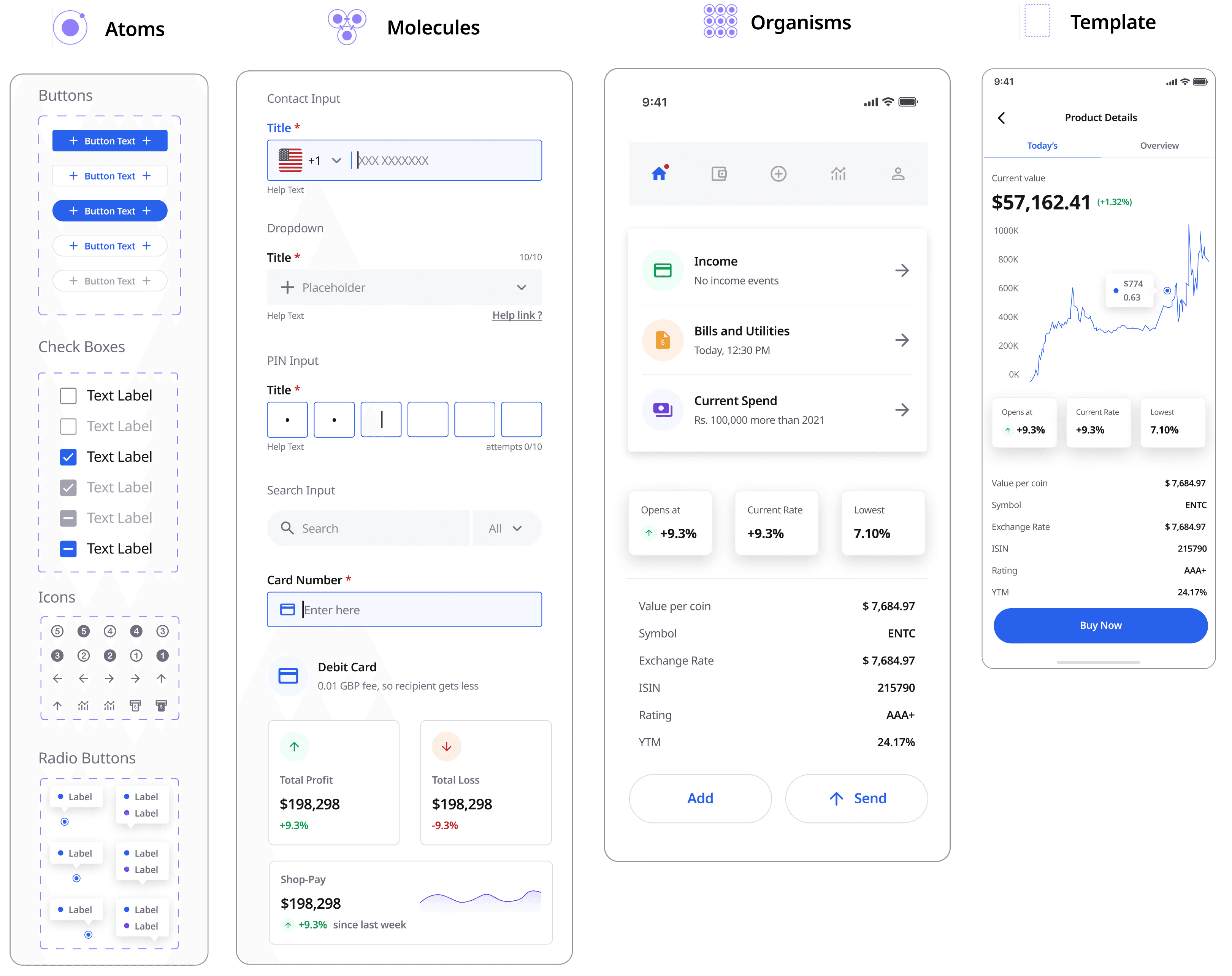
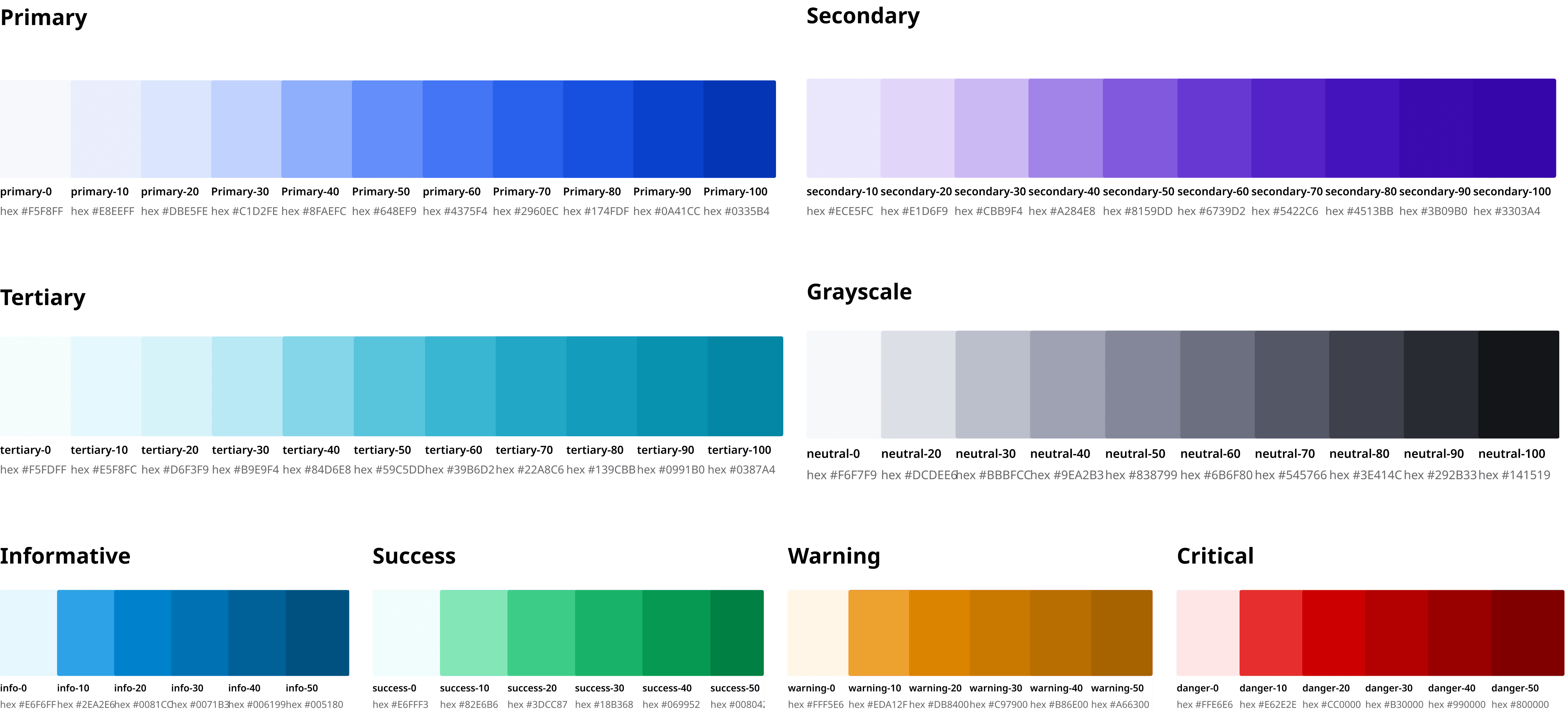
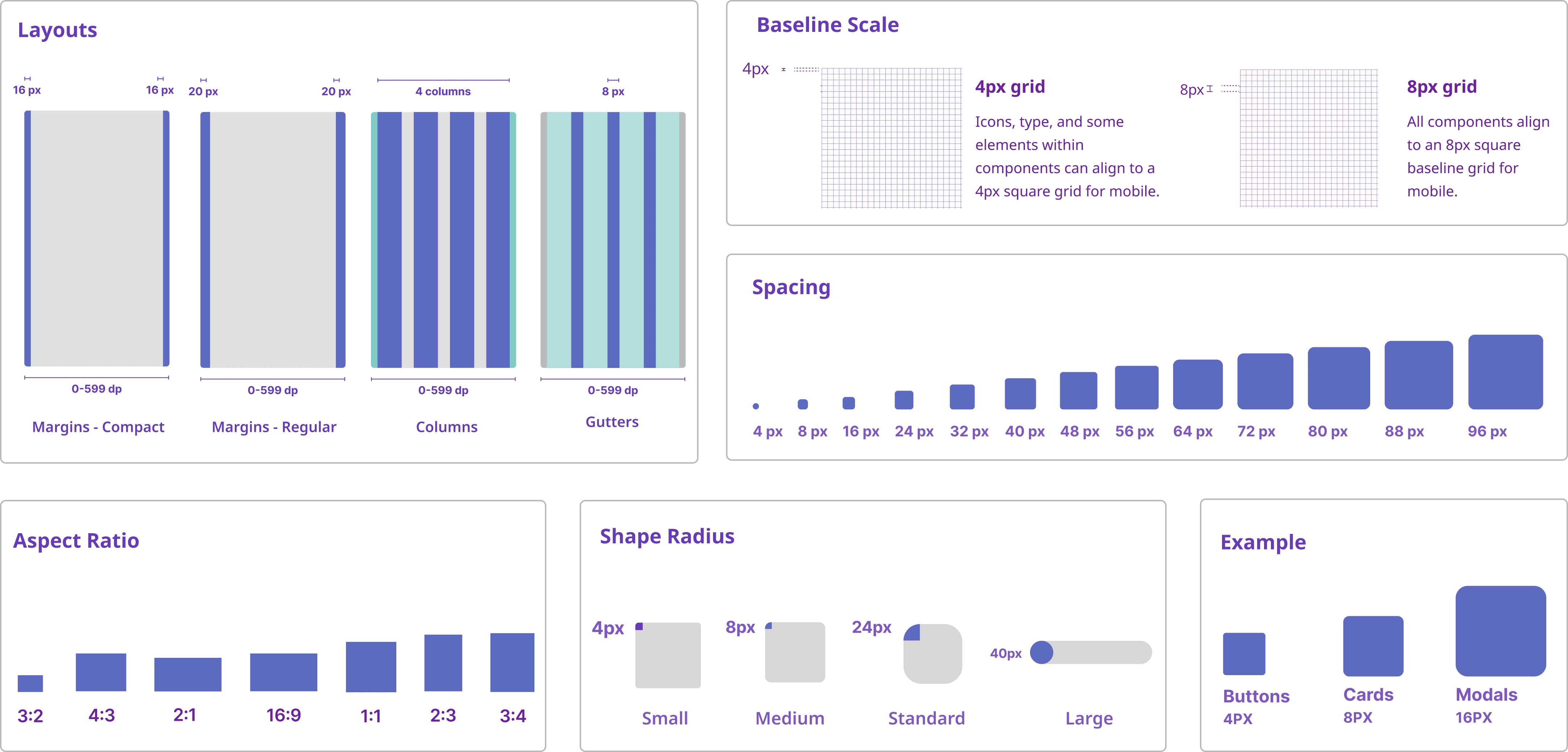
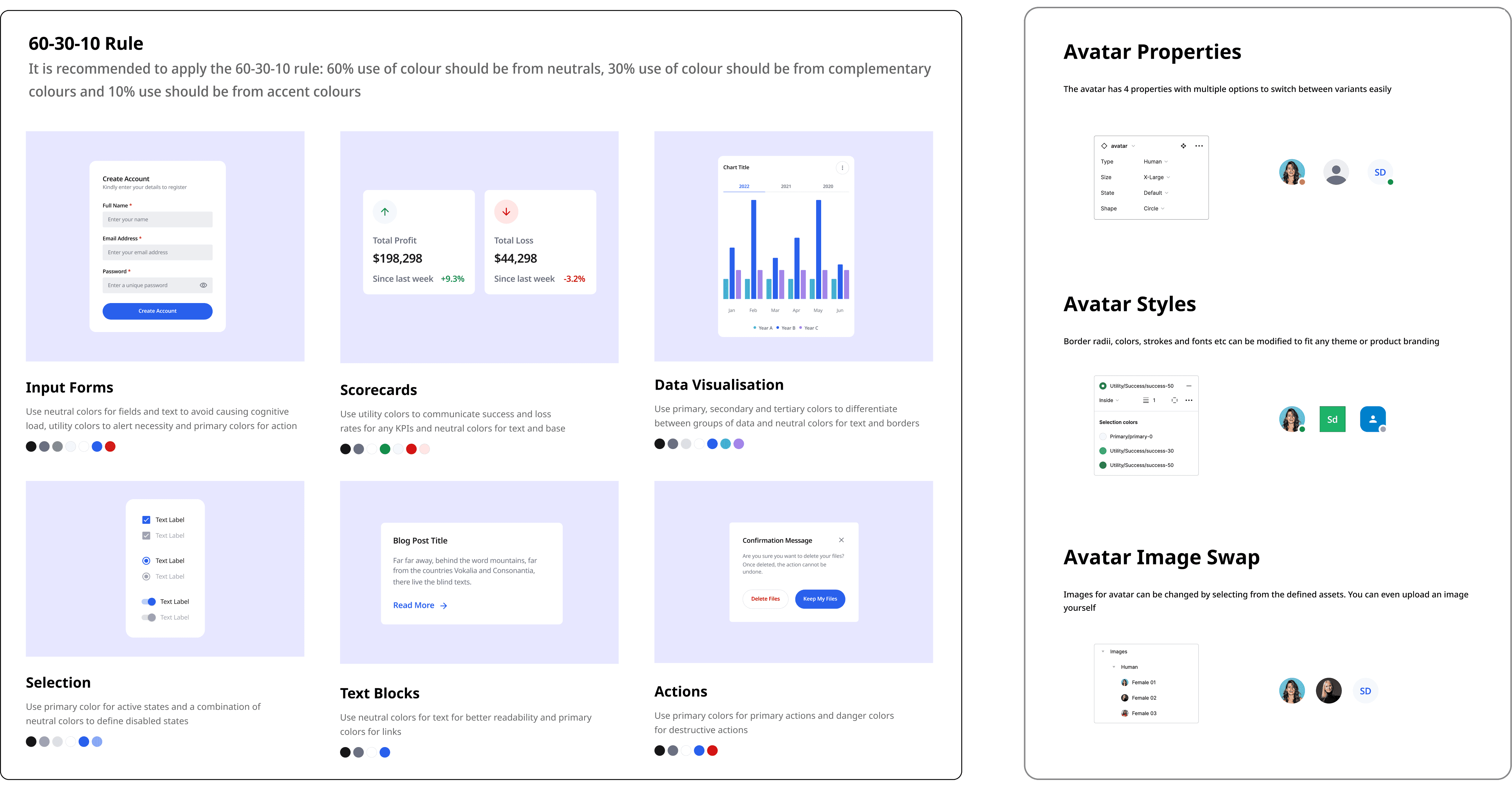
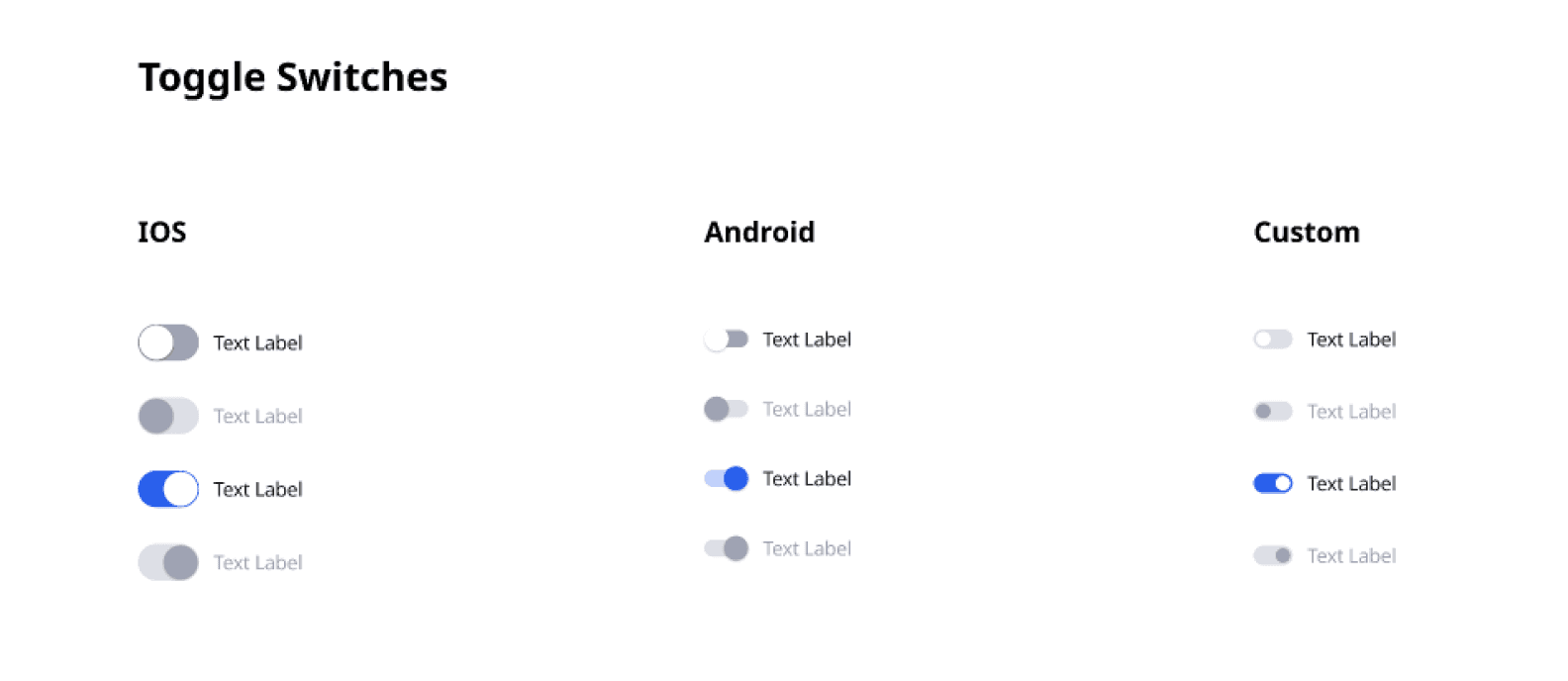
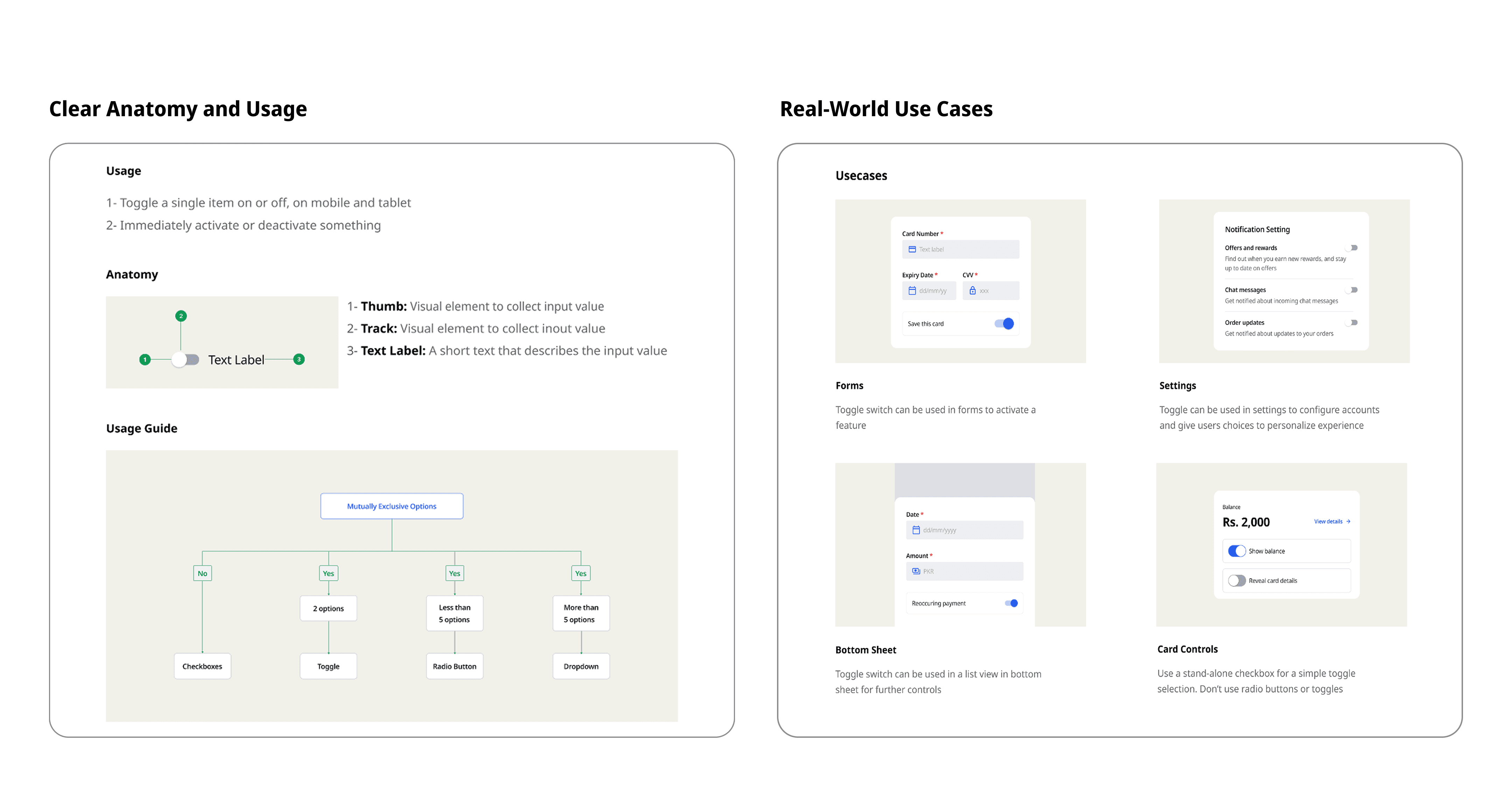
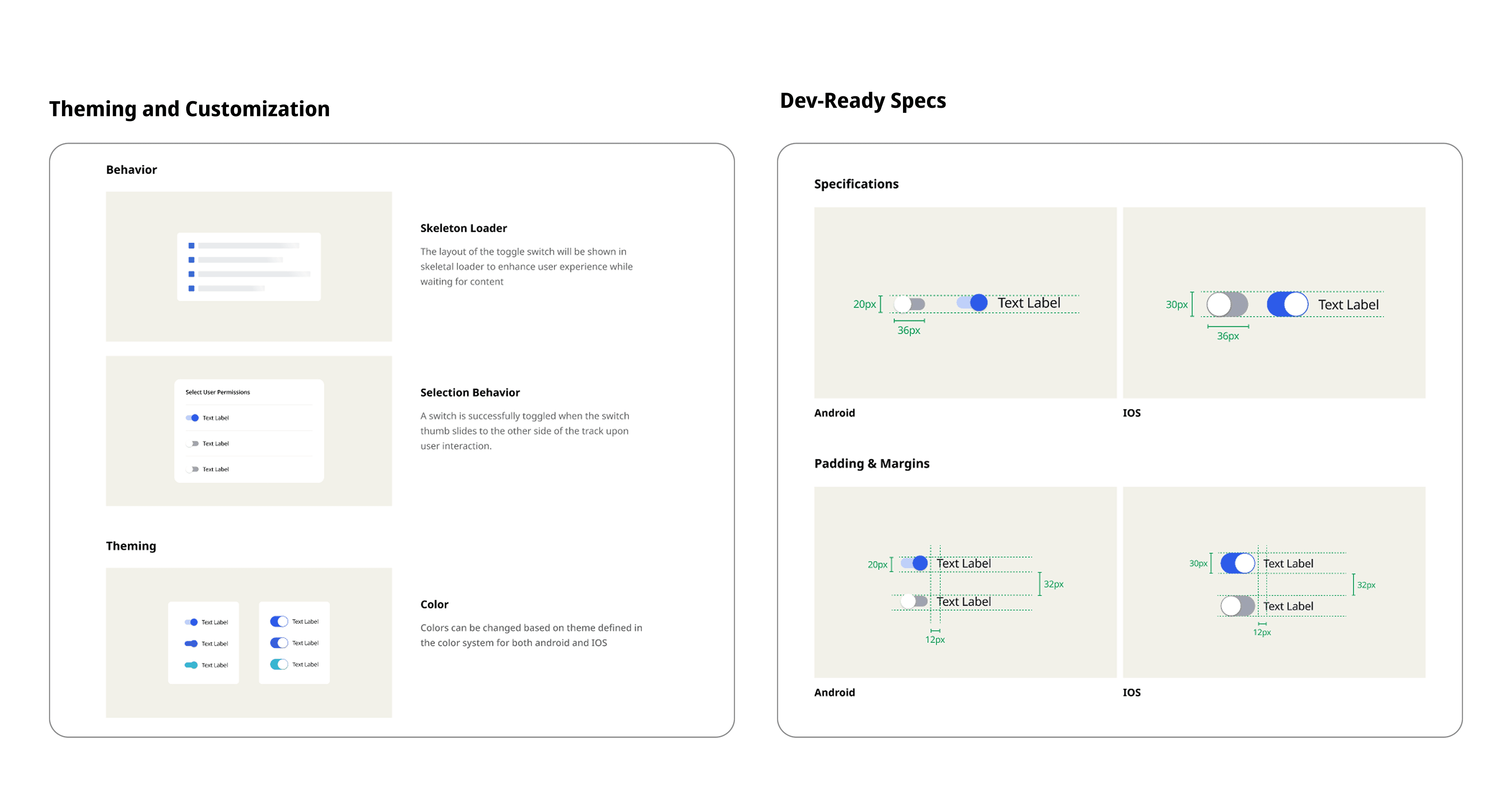
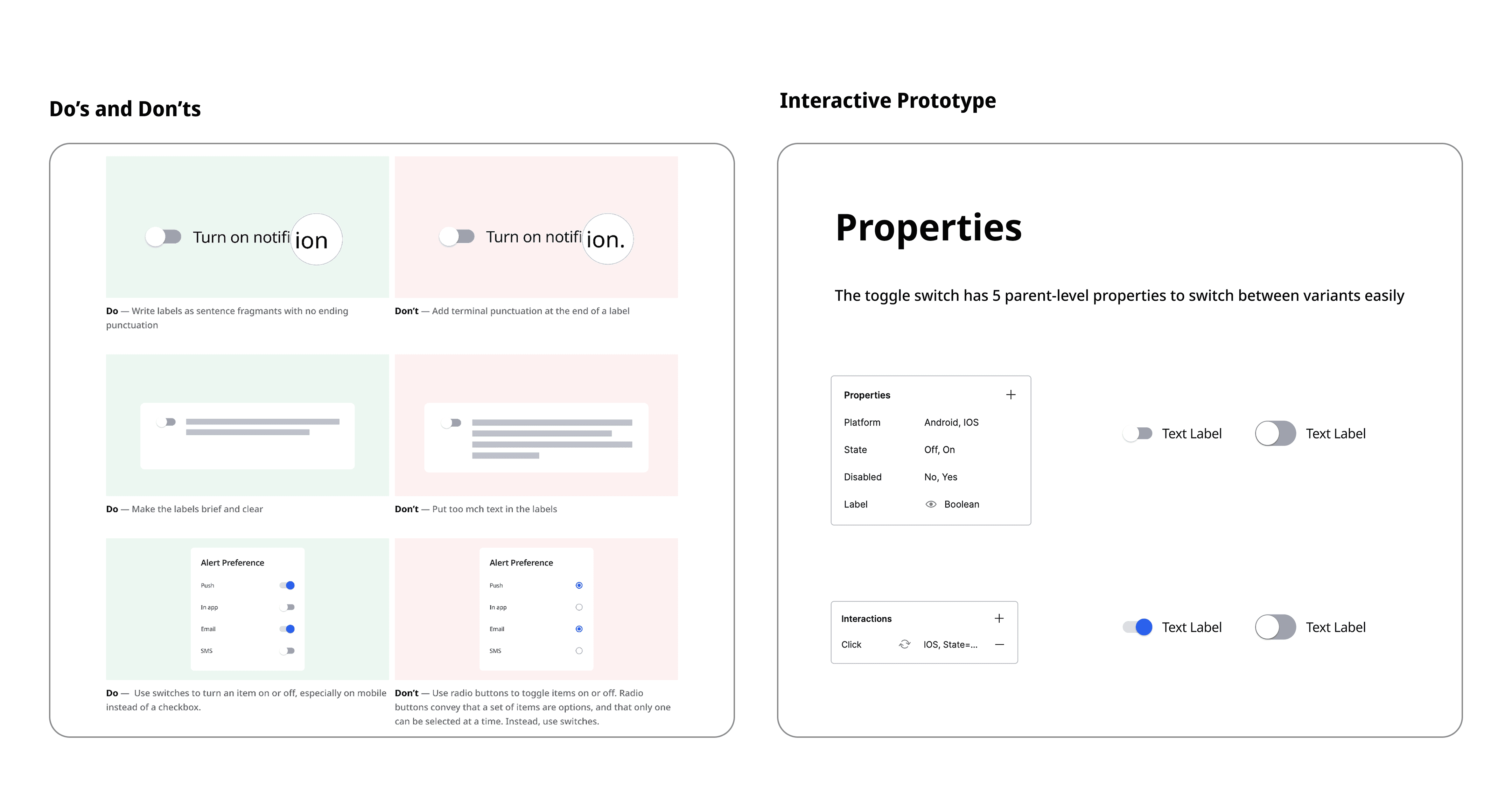
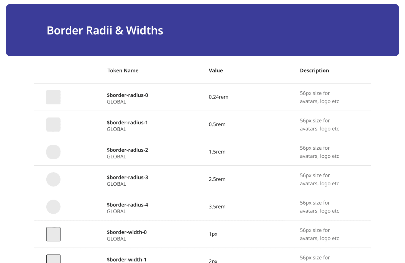
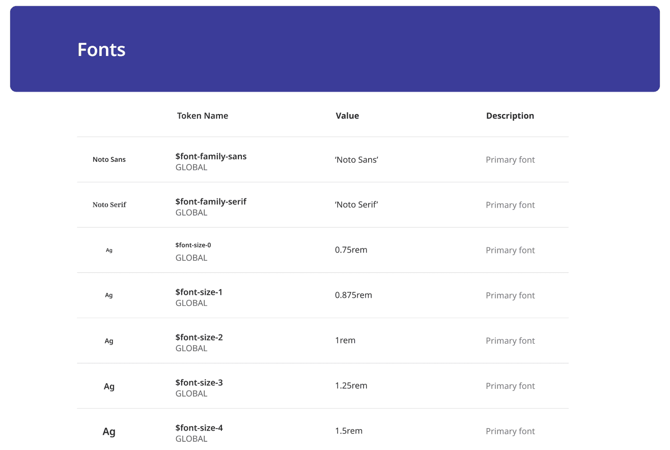
As a Product Designer at Zeno, I led the creation of a scalable design system for a crypto wallet platform to unify UI components, streamline developer handoff, and ensure visual consistency across the app.
Partnered with Project Managers and 2 front-end engineers to audit screens, define a shared dev sheet, and build a modular system, reducing design-dev back-and-forth by 40% and speeding up UI delivery by 50%.