Pediatric Asthma Care Ecosystem

Pediatric Asthma Care Ecosystem

Healthcare UX

Healthcare UX

SaaS Dashboard Design

SaaS Dashboard Design

B2B

B2B

I was the Senior UX and Lead designer -responsible for the iOS app used by patients and caregivers, and the web dashboard embedded inside physician EHR software. I took both from blank canvas to production.

I was the Senior UX and Lead designer -responsible for the iOS app used by patients and caregivers, and the web dashboard embedded inside physician EHR software. I took both from blank canvas to production.

The project itself :

Project Overview

Flow Digital Health is a remote monitoring platform for pediatric asthma - a full-stack healthcare system connecting clinicians, patients, and insurers.

It is designed to operate between clinic visits, where most asthma care breaks down, enabling continuous monitoring, early intervention, and better outcomes.

I led the design of the entire ecosystem:

  • A clinical dashboard embedded inside the EHR

  • A patient & caregiver mobile app

  • A billing-aware system tied to CPT reimbursement

This wasn’t three products.
It was one system where care delivery, engagement, and revenue had to work together.

context:

Brief I Was Given

Five million children in the US have asthma. Most of them see a specialist every three to six months. In between, families manage a condition that changes daily — shaped by air quality, medication adherence, pollen, weather, and school schedules — with no clinical infrastructure to help them.

Trace Air Quality builds state-of-the-art air quality forecasting technology. The founders' insight: over 85% of asthma attacks have an environmental trigger - and those triggers are predictable 24–72 hours in advance. hat means attacks aren't just treatable - they're largely preventable. The question was whether we could close the loop: connect real-time environmental data to a specific child's trigger profile, keep families engaged daily, and surface structured clinical data to the physician so they could act on it.

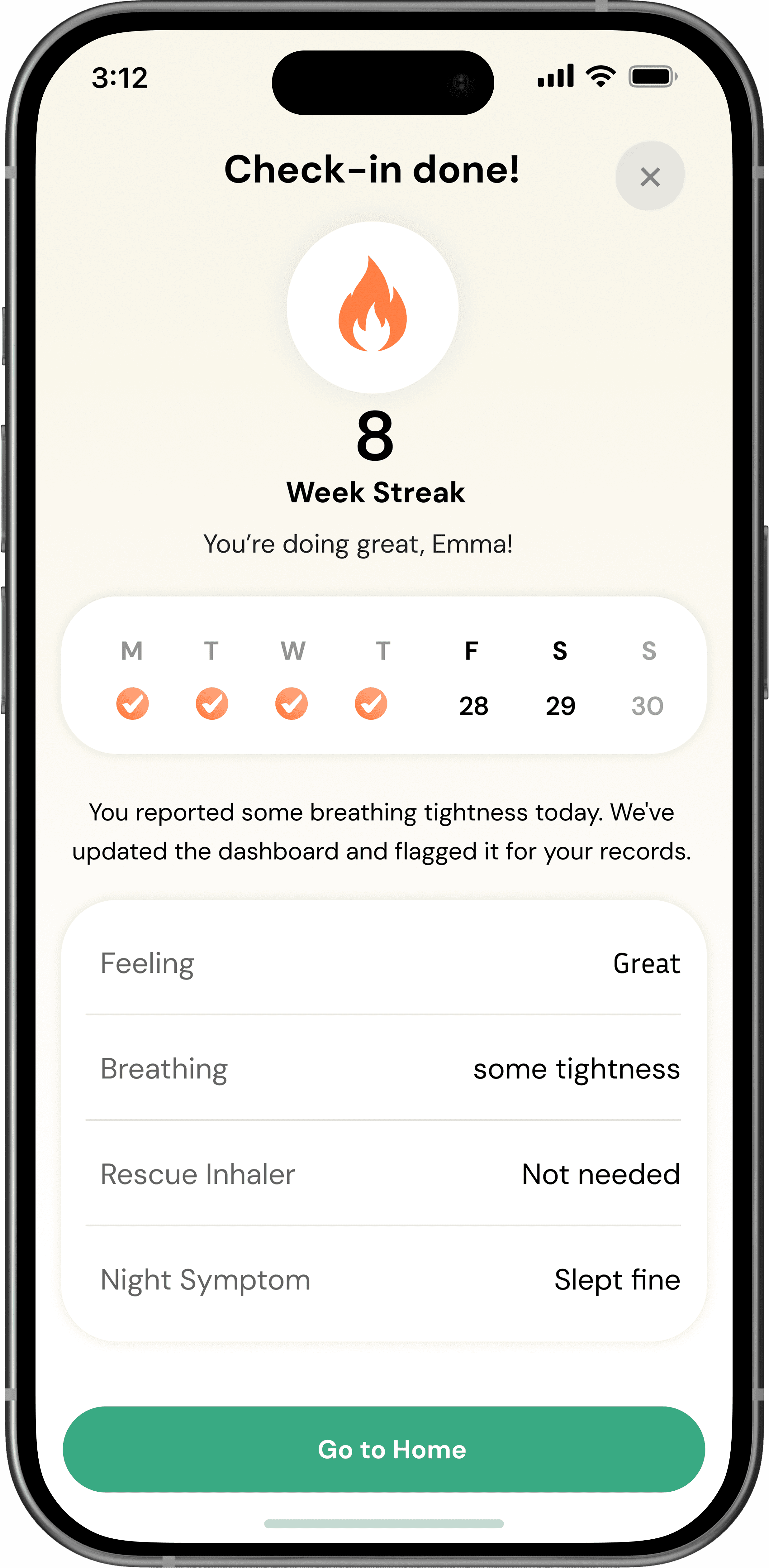
My brief was to design a product that would sit between clinical visits — where nothing currently exists — and make that environmental intelligence actionable for the people who matter most:

  • The child living with asthma,

  • Their caregiver, and

  • The clinician managing their care

  • There was a fourth stakeholder too: the insurer. They pay for emergency room visits. If this product works, they pay less.

That financial logic is what makes Remote Therapeutic Billing RTM billing — where insurers reimburse clinicians for remote monitoring — the mechanism that holds the whole ecosystem together.

There was no prior product, no existing design system, and no direct competitor doing all of this in one place.

The Problem

No continuous clinical signal:

Doctors see patients every 3–6 months.
Asthma changes daily.
Decisions were being made on snapshots, not trends.

The environmental blind spot:

85% of asthma attacks are triggered by AQI, pollen, PM2.5 — but this data was never tied to the individual patient.

The engagement drop-off:

Every tracking app loses patients within weeks.
Children don’t stick to “clinical tools”.

The Underlying Tension: Clinical tools are built for rigor. Consumer products are built for retention. Children's products are built for delight. I needed to build something that was all three at once — and that didn't trade any of them off against the others. That's the design problem.

All about the research :

Stakeholder Mapping

I didn’t start with users.
I started with the dependency chain.

In week two, I ran a stakeholder mapping exercise with the founder.

The method: list every person whose behavior the product needed to change - not just people who’d touch the UI, but anyone whose participation the product required to function. Then draw the dependency arrows between them.

What emerged was a chain. Child's daily engagement produces the data. Without data, caregiver has nothing to monitor. Without caregiver’s oversight, clinicians don’t get structured input. Without clinical documentation, insurers won’t reimburse. Without reimbursement, clinicians have no financial reason to enroll patients. Without enrolled patients, Patient never downloads the app.

I also asked each user type one diagnostic question: “What would make you stop using this?” Their answers were the dependency map in reverse — each person’s exit condition was the previous person’s failure mode. That exercise told me where the chain was weakest before I’d designed a single screen.

nice interior

User Interviews

What Four Stakeholders Actually Need.

We worked with clinical advisors at the University of Utah, shadowed pediatric pulmonology appointments, and conducted interviews with caregivers of children with asthma. These findings reflect what we learned — not what I initially assumed.

nice interior

Process

How I Worked Through It

Being the only designer on a 0→1 health product meant I had to move fast without cutting corners on the things that matter in clinical UX: accuracy, trust, and accessibility.

Storyboards

The series of hand-drawing frames that visually describe and explore a user's experience with a product. 

I began with drawing storyboards to focus on just the most important parts of a user’s experience with the app. It's a story that was told through the panels, revealed it two different way

nice interior

The Product :

What We Shipped

Two connected surfaces -

  • a consumer iOS app for patients and caregivers

  • a clinical web dashboard for physicians.

Both built on the same data layer.

Mockups

These are a high fidelity design that represents a final product

I created all the app pages mockups, incorporating the right design elements such as typography, color, and iconography. I also included captivating and visually appealing images, and developed all the necessary components and elements.
The goal was to demonstrate the final Voo's app in as much detail as possible.

Everything a Parent Needs at a Glance

It's the detailed, interactive version of designs that closely match the look and feel of the final product. 

Voo's High-fidelyty prototype

Caregiver Home Screen

The dashboard surfaces the most urgent signal first — the ARC (Asthma Risk Control) score with trend direction, a personalized AQI alert tied to the child's known triggers and zip code, a 4-day forecast, and a morning checklist that resets daily.

A 16-day streak counter drives daily engagement — each day of data is a data point the clinician didn't have before. The Flowee mascot serves as a friendly guide without infantilizing the caregiver.

Weekly ARC Assessment

The ARC assessment is a validated 25-question instrument. Questions 1–20 are for Emma: illustrated, emoji-anchored, written in second-grade language. Questions 21–25 are for Sarah: clinical framing appropriate for an adult caregiver observing symptoms.

The design requirement I gave myself: both sets of questions had to be completed in the same session, on the same device, without compromising the clinical validity of either. The solution was a deliberate mid-flow context switch — a full-screen "hand the phone" transition that reframes everything. Typography weight, question framing, vocabulary, and interface language all shift after Q20.

Alternative I considered and rejected: Sending caregivers a separate notification to complete Q21–25 after Emma finished. This would have broken the session, reduced completion rates, and introduced a delay between the child's report and the caregiver's — weakening the clinical pairing. The same-session handoff was harder to design but produced better data.

Voo's High-fidelyty prototype

ARC Result & Trend

In early prototypes I designed the score as the hero — large number, color-coded ring, prominent. Testing told a different story: caregivers saw "25" and either panicked or shrugged, with no consistent interpretation. The number alone doesn't mean anything without context. A 25 after a week of 8 is an emergency. A 25 after three weeks of 24 is noise.

I redesigned around the pattern: the risk tier label ("High Risk") is the primary headline. The trend chart — 7 weeks, color-coded by tier — is the main data object. The score becomes a supporting detail beneath the label. When a score spikes, the system surfaces a personalized explanation connecting the jump to AQI exposure and rescue inhaler use — so Sarah understands why before she decides what to do.

The Share Report flow lets Sarah email a structured PDF summary directly to Dr. Patel — generating the documented RTM transmission the insurer needs for reimbursement.

Flowee — AI Assistant

The original brief was "add an AI chatbot." I pushed back on the framing. A generic prompt field is useless if the user doesn't know what to ask — and in a health context, an empty chat window feels clinical and cold.

Instead, I designed Flowee to open with a proactive, contextual status summary: today's AQI, Emma's current weekly score, and whether the check-in is done. Three pieces of information Sarah would otherwise have to navigate to separately, surfaced in one sentence.

The quick-reply chips — "Explain score," "Start check-in," "What does AQI 87 mean?" — reduce the cold-start problem. Sarah can get value without composing a question from scratch. Flowee's visual identity as the skateboarding robot mascot creates continuity with Emma's experience and keeps the tone warm without being condescending to adults.

Voo's High-fidelyty prototype

Designed for the
Clinical Workflow

The clinic product was a harder design problem than the app. Clinicians won't adopt a new tool, they'll adopt a new tab in the tool they already use every day.


After early research revealed that a standalone portal would fail on adoption, I redesigned the entire clinical experience to embed inside the existing EHR patient chart, not as a replacement, but as a new "Flow DH" tab. Everything lives within the mental model the physician already has.

Takeways

The series of hand-drawing frames that visually describe and explore a user's experience with a product. 

Impact:

Our target users have found Voo's design to be intuitive, user-friendly, and easy to use: choose a movie, select seats, and buy tickets.

What I learned:

The key lesson I learned is that even minor changes can significantly impact the user experience. My biggest takeaway is to always prioritize the genuine needs of the user.

What I'd Do Differently,
and What I'm Proud of

Being the only designer on a health product taught me a lot about clinical UX, and exposed gaps in my own process.

The work I’m proudest of is the dual-voice survey. It was a complex problem with real clinical stakes, and the solution, a deliberate mid-flow context switch, came from designing around the relationship between two people sharing the same device, not just standard UI patterns.

What I’d change:

I would prioritize accessibility much earlier, especially around the ARC score risk tiers, which relied too heavily on color at first.

I’d also rethink onboarding. Trigger profile setup drives every personalized alert, but the current flow treats it as secondary when it should be the centerpiece of the experience.